True conversion rate optimization (CRO) means dissecting every step, from the first ad click to the final thank you page. It involves understanding user psychology, getting rid of hesitation, and building undeniable trust. Why do users add to their cart but never check out? What information is missing from your product page that stops a potential buyer? Answering these questions is the key to real growth. Generic tips won’t get you there, but a focused method will. For a broader look, you can check out these 11 Expert Tips to Improve Website Conversion Rates.
This article cuts through the noise. I’m not going to give you a checklist of obvious tasks. Instead, you’ll get a detailed breakdown of 10 actionable strategies that address the real reasons people don’t buy. From setting up a cart recovery sequence that actually works to using social proof that builds real credibility, each point is designed to be implemented immediately. This isn’t just about getting more clicks; it’s about turning those clicks into loyal, paying customers.
1. Win Back Sales with Abandoned Cart Recovery
Nearly 70% of online shopping carts are abandoned before checkout. That’s not just a lost sale; it’s a signal from a high-intent customer who was one click away from converting. A systematic abandoned cart recovery strategy is a must-have for improving ecommerce conversion rates because it re-engages these warm leads automatically. The goal is to gently remind shoppers what they left behind and make it easy for them to complete their purchase.
This process usually involves an automated sequence of messages sent by email, SMS, or even push notifications. For example, a Shopify store using an app like Klaviyo can trigger a three-part email series. The first email, sent within an hour, is a simple reminder. A second email, sent 24 hours later, might offer a small discount. A final email at 48 hours could create urgency by mentioning low stock. This multi-channel approach significantly increases the chances of winning back a customer who may have just gotten distracted.
How to set up a recovery sequence that works
To build a recovery workflow that gets results, focus on timing, value, and clarity. Avoid generic, one-size-fits-all messages.
- Act Quickly: Send the first reminder within one hour of abandonment. The purchase is still fresh in the customer’s mind, and this message often feels more like a helpful nudge than a sales pitch.
- Include a Clear Call-to-Action (CTA): Use direct language like “Return to Your Cart” or “Complete Your Order.” The button should link directly back to a pre-populated cart to reduce friction.
- Show, Don’t Just Tell: Always include high-quality images of the exact products left in the cart, along with the price and any applicable taxes or shipping costs. Transparency builds trust.
- Offer a Smart Incentive: If a simple reminder doesn’t work, consider adding a small, time-sensitive discount (like 10% off for the next 24 hours) in your second or third follow-up.
This targeted follow-up is a key part of a strong sales funnel and plays a huge role in customer retention. For a deeper look into keeping customers engaged, you can learn more about effective customer retention strategies.
2. Simplify the Checkout Process
The checkout page is the final step, but it’s where a surprising number of sales fall apart. A complicated, slow, or untrustworthy checkout process creates friction and doubt, causing up to 21% of shoppers to abandon their carts. Simplifying this final stage is a direct path to improving ecommerce conversion rates because it removes barriers for customers who have already decided to buy. The goal is to make paying as simple and fast as possible.

This means thoughtfully reducing steps, form fields, and potential distractions. Think of Amazon’s one-click checkout or the smooth payment flows offered by services like Stripe. These systems work by remembering customer information and adding popular payment methods like Apple Pay and Google Pay, turning a multi-step process into a single interaction. For any ecommerce store, the principle is the same: every removed field and every saved second brings a customer closer to completing their purchase.
How to streamline your checkout
To build a checkout that converts, prioritize speed, trust, and simplicity. Every element should serve the singular purpose of finalizing the sale without causing confusion.
- Offer Guest Checkout: Don’t force users to create an account. This is a major point of friction. Provide a prominent guest checkout option and offer to save their details for next time after the purchase is complete.
- Minimize Form Fields: Only ask for essential information. Do you really need a phone number or a second address line? Use tools like address auto-completion (e.g., Google Places API) to speed up data entry.
- Show Trust Signals: Prominently display security badges (like SSL certificates, McAfee, or Norton) and accepted payment logos (Visa, PayPal, etc.). This reassures customers that their financial information is safe.
- Use a Progress Bar: For multi-page checkouts, a visual progress bar shows customers where they are in the process and how many steps are left. This manages expectations and reduces the feeling of a long, drawn-out process.
- Enable Digital Wallets: Integrate one-tap payment options like Apple Pay, Google Pay, and PayPal. These methods are fast, secure, and remove the need for customers to manually enter card details, especially on mobile.
3. Improve Your Product Pages
Your product page is the final step before a customer clicks “Add to Cart.” If it fails to show value, answer questions, and build trust, even the most interested shopper will hesitate. Product page optimization is the process of improving every element on this page, from images and descriptions to reviews and social proof. It’s a critical part of improving ecommerce conversion rates because it directly addresses a buyer’s final concerns before they commit.
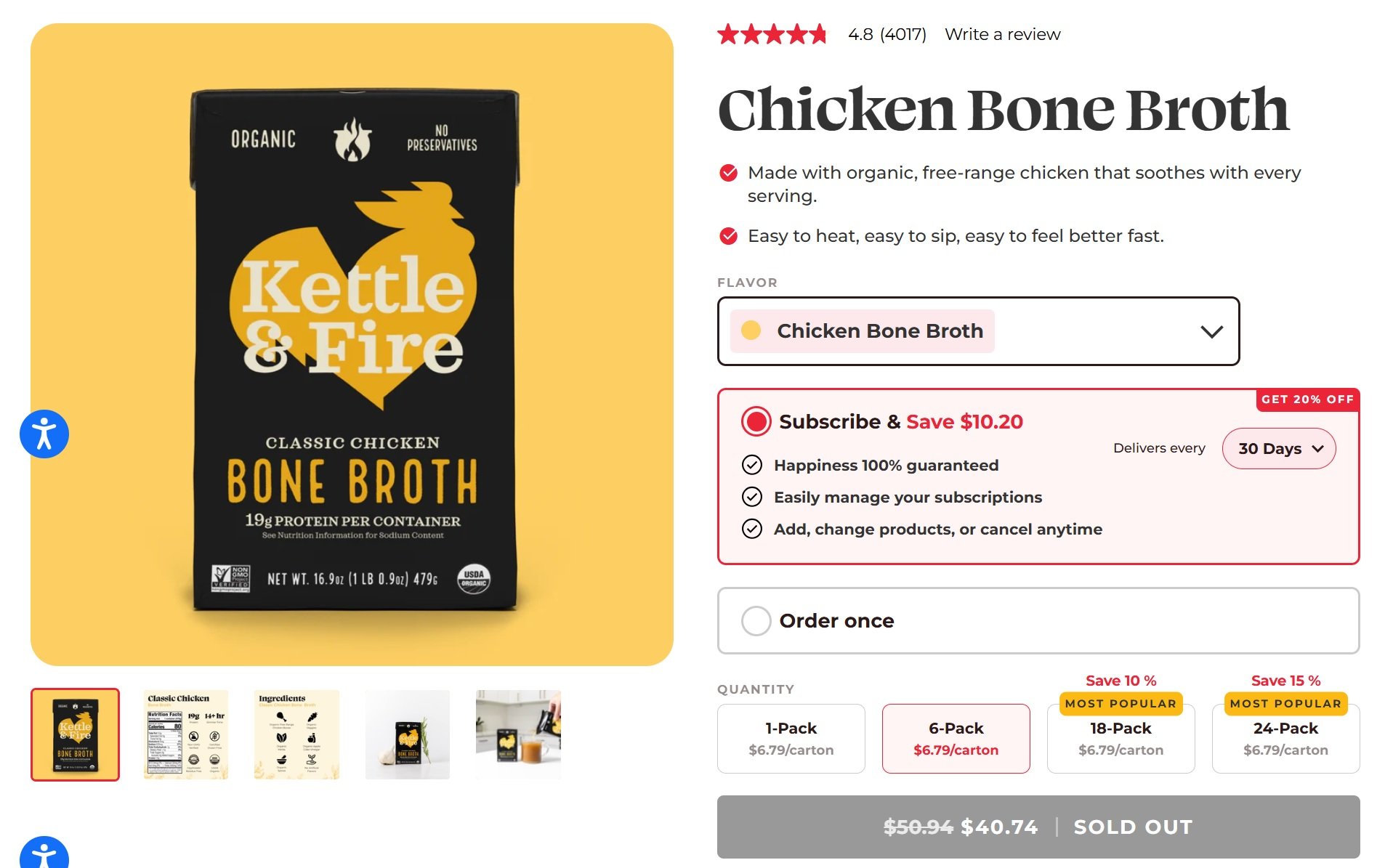
The perfect example of this is Kettle & Fire. Their Chicken Bone Broth page clearly demonstrates how a well-structured layout can convert browsers into buyers. Every detail serves a purpose, from high-quality product imagery and concise benefit-driven copy (“Made with organic, free-range chicken”) to transparent pricing and an easy subscription model. The design isn’t flashy; it’s functional, trustworthy, and speaks directly to what buyers care about most, quality, convenience, and confidence in what they’re purchasing..
How to make your product pages better
To create a high-converting product page, you must anticipate and answer your customer’s questions with your visuals and text. A disorganized or unconvincing page is a major conversion killer.
- Use High-Quality Visuals: Include at least six high-resolution photos showing the product from different angles, in use, and highlighting key features. A short video showing the product in action can significantly lift conversions.
- Write Compelling, Scannable Copy: Use clear headings and bullet points to break down features and benefits. Don’t just list what it is; explain how it solves the customer’s problem.
- Showcase Social Proof: Prominently display your best customer reviews and ratings near the top of the page. User-generated photos or testimonials are even more powerful for building trust.
- Provide Complete Information: Add necessary details like size charts, fit guides, material specifications, or compatibility tables. The more information you provide, the less reason a customer has to leave your site to do more research.
Optimizing these elements is fundamental for any online store, but it’s especially important on competitive platforms. To see how these principles apply in marketplaces like Amazon, you can explore more about optimizing Amazon product pages for better performance.
4. Use Personalization and Dynamic Content
Modern shoppers expect experiences customized for them. Personalization and dynamic content address this by delivering custom shopping experiences based on individual customer data, browsing history, and purchase behavior. This strategy is key to improving ecommerce conversion rates because it makes shoppers feel understood, showing them the most relevant products and offers at the right time. The goal is to make the user journey feel less like browsing a catalog and more like a conversation with a helpful sales assistant.
It involves changing website elements in real-time, such as product recommendations, homepage banners, and promotional offers.
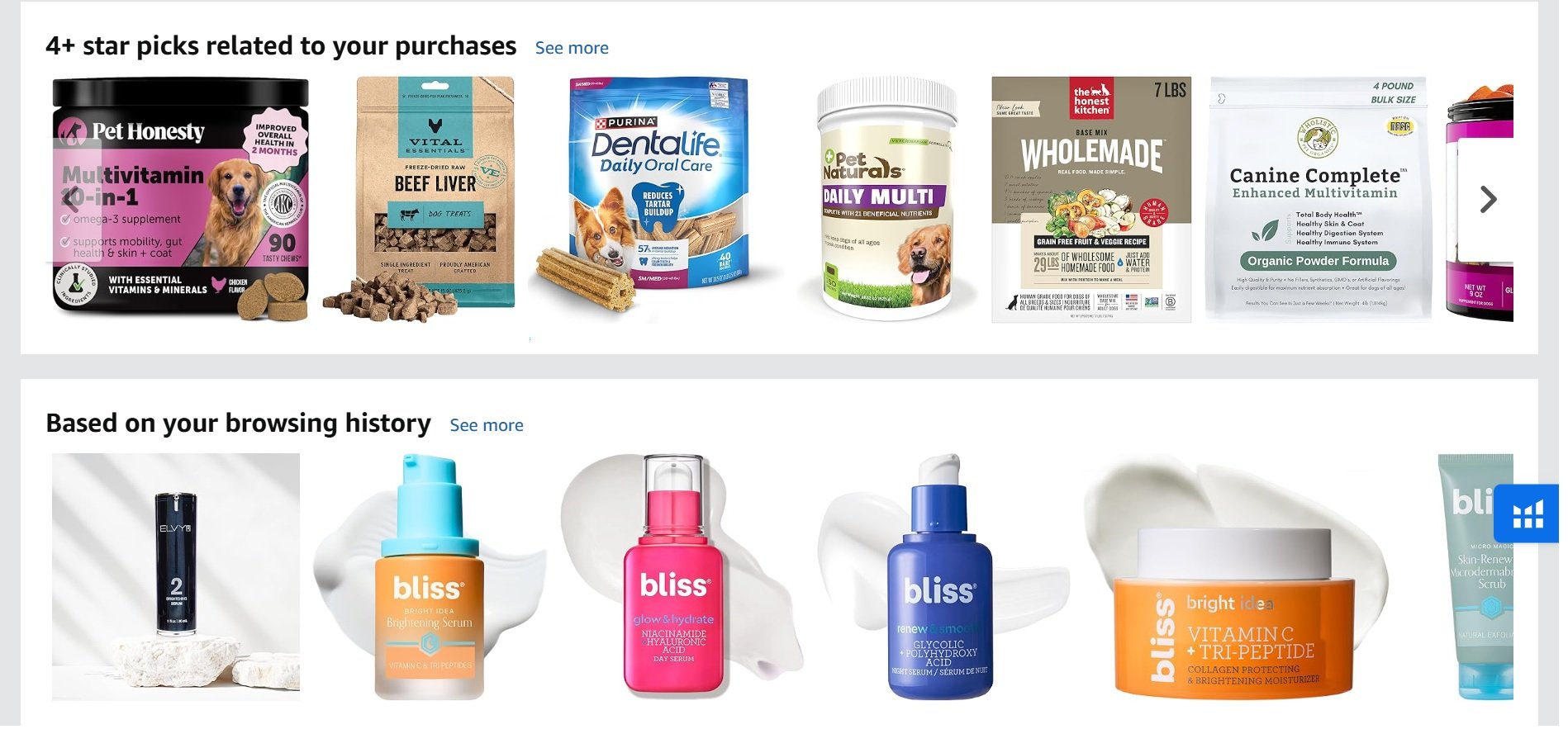
For instance, Amazon shows personalized recommendations like “4+ star picks related to your purchases” and “Based on your browsing history,” as seen in the screenshot above. This custom experience helps shoppers discover products that match their interests and past behavior, increasing engagement and conversion rate.
How to use personalization effectively
To build a personalized experience that converts, you need to use customer data intelligently without being intrusive. Start small and test everything.
- Start with On-Site Behavior: Begin by tracking what users do on your site. Show “Recently Viewed” and “Customers Also Bought” sections based on a user’s current session.
- Use Geolocation for Relevant Offers: Display content based on the user’s location. This could be as simple as showing prices in the local currency or as advanced as promoting seasonal items relevant to their climate.
- Implement a Preference Center: Let customers tell you what they want. A preference center where users can select their interests (e.g., product categories, communication frequency) provides valuable data and shows respect for their choices.
Effective personalization is a core part of a successful sales funnel. For more ideas on creating relevant content, you can explore advanced ecommerce content marketing strategies.
5. Build Confidence with Trust Badges and Security Signals
For many online shoppers, clicking “Add to Cart” is easy, but “Complete Purchase” is a moment of hesitation. They wonder: “Is my payment info safe?” or “Is this a real business?” Trust badges and security signals are visual cues that answer these questions, reassuring customers that your store is legitimate and their transaction is secure. This is a simple yet powerful way of improving ecommerce conversion rates by directly addressing last-minute fears.
These signals aren’t just about showing a Norton Secured seal. They also include money-back guarantees, free return policies, customer testimonials, and logos of well-known payment providers like Visa and PayPal. For example, Warby Parker’s 30-day home try-on guarantee is a massive trust signal that removes the risk of buying glasses online. By displaying these symbols prominently, especially on product pages and during checkout, you reduce friction and give shoppers the confidence to finalize their purchase.
How to display trust signals effectively
Strategic placement and authenticity are key. Overloading your site with badges can look spammy, so focus on what truly matters to your customers.
- Place Badges Strategically: Display security seals and accepted payment logos directly below the “Proceed to Checkout” button. This is where payment anxiety is highest.
- Highlight Guarantees: Showcase your money-back guarantee or return policy near the “Add to Cart” button and in the site’s header or footer. Use clear, simple icons and text like “30-Day Hassle-Free Returns.”
- Use Social Proof: Feature real customer testimonials with photos and names. A snippet from a positive review on a product page is often more convincing than a generic badge.
- Limit the Clutter: Choose two or three of the most recognizable and relevant badges for your checkout page. A familiar logo from Norton or McAfee combined with payment provider logos is often enough.
These visual reassurances are critical for overcoming buyer hesitation. To explore how this fits into the broader customer journey, you might want to read about creating an effective sales funnel.
6. Use A/B Testing for Continuous Improvement
Guesswork has no place in a high-performing ecommerce strategy. A/B testing, or split testing, is the methodical process of comparing two versions of a webpage to see which one performs better. This data-driven approach removes assumptions from the equation, letting you make decisions based on evidence that are proven to increase conversions. The goal is to systematically test your ideas and let your customers’ behavior tell you what works.
This practice is fundamental to continuous improvement because it creates a feedback loop. For instance, you could test two different product page headlines: one focusing on a feature (“Durable Ripstop Fabric”) and another on a benefit (“Tear-Proof for Any Adventure”). By sending 50% of traffic to each version using a tool like Optimizely or VWO, you can measure which headline leads to more “Add to Cart” clicks. Improving ecommerce conversion rates is a marathon, not a sprint, built on small, incremental wins.
How to run A/B tests effectively
A successful testing program relies on a clear hypothesis, patience, and precise analysis. Rushing to conclusions or testing too many things at once can invalidate your results.
- Test One Element at a Time: To know what caused a change, isolate your variables. Test the CTA button color or the button text, but not both at the same time. This ensures you can attribute the performance change to a specific element.
- Ensure Statistical Significance: Don’t end a test after a few hours or a handful of conversions. Wait until your testing software confirms the results are statistically significant, meaning the outcome is likely not due to random chance. This usually requires running a test for at least one to two weeks.
- Prioritize High-Impact Pages: Start testing on pages that get the most traffic, like your homepage, category pages, or top-selling product pages. Small improvements on these pages can lead to significant overall revenue gains.
- Document Everything: Keep a detailed log of every test you run: what you tested, your hypothesis, the duration, the results, and what you learned. This knowledge base becomes a valuable asset for future optimization.
7. Use High-Quality Product Images and Video
In ecommerce, your product images and videos are your digital storefront, salesperson, and packaging all in one. Since customers can’t physically touch your products, high-quality visuals are essential for bridging that gap. They reduce purchase uncertainty, answer unasked questions, and build the emotional connection needed to click “Add to Cart.” This is a fundamental part of improving ecommerce conversion rates because it directly impacts how a customer perceives a product’s value.
Simply uploading a few basic photos is no longer enough. Successful brands use a mix of professional photography, 360-degree views, lifestyle shots, and detailed product demo videos. For example, fashion retailers like ASOS provide videos of models walking in the clothes, helping shoppers see how items fit and move. These visuals don’t just show a product; they demonstrate its use and feel, helping customers make a confident buying decision. For more on this, check out guides on marketing product designs effectively with mockups.
How to build a winning visual strategy
To make your visuals work for you, think like your customer. What do they need to see to feel confident about their purchase? Your goal is to eliminate doubt and create desire.
- Provide Multiple Angles: Showcase your product from every side. Include a minimum of 3-5 high-resolution images per product, covering the front, back, sides, and close-up details.
- Show, Don’t Just Tell, with Video: Create short (30-60 second) videos that demonstrate key features, explain how to use the product, or show its scale. Dyson’s feature-rich demo videos are a perfect example.
- Use Lifestyle Imagery: Help customers visualize the product in their own lives. Show apparel on diverse body types, tech gadgets in a real-world setting, or home decor in a styled room. This contextualizes the product.
- Optimize for Speed and Detail: Ensure your images load quickly without sacrificing quality. Compress file sizes and enable a zoom function so shoppers can inspect materials up close.
- Use User-Generated Content (UGC): Encourage customers to share their own photos. Featuring real customer images builds social proof and provides authentic context that shoppers trust.
Investing in strong visuals is non-negotiable for any serious ecommerce store. It’s also important to follow platform-specific guidelines when selling on marketplaces. You can learn more about Amazon image requirements to ensure your listings are always compliant and optimized.
8. Use Email Marketing and Segmentation
Generic, one-size-fits-all email blasts are a thing of the past. Today, improving ecommerce conversion rates requires a smart approach to email marketing centered on segmentation. By dividing your audience into smaller, targeted groups based on their behavior or purchase history, you can deliver highly relevant messages that get a response. The goal is to make each customer feel understood, not just marketed to.
This strategy allows you to send personalized content that nurtures customers through their entire journey. For instance, a new subscriber receives a welcome series introducing the brand, while a repeat customer gets exclusive access to new products. Platforms like Klaviyo and Mailchimp excel at this, letting you create automated workflows. Sephora’s birthday rewards emails are a perfect example of segmentation in action, creating a personalized experience that builds loyalty.
How to use email segmentation effectively
To build email campaigns that convert, you must move beyond batch-and-blast emails. Focus on delivering the right message to the right person at the right time.
- Build a Welcome Series for New Subscribers: Create a 5-7 email sequence that introduces your brand story, showcases best-sellers, and offers a small incentive on their first purchase. This is your best chance to make a strong first impression.
- Segment Based on Purchase History: Group customers by what they’ve bought, how often they buy, and how much they spend. You can create segments for VIPs, one-time buyers you want to reactivate, or customers who purchase from a specific category.
- Launch Re-engagement Campaigns: Target subscribers who haven’t opened an email or made a purchase in 90 days. A “We Miss You” campaign with a compelling offer can win back a significant portion of this inactive audience.
- Use Dynamic Content: Personalize email content based on user data. Show product recommendations based on past browsing history or feature items related to a previous purchase to make your messaging more relevant.
A well-executed segmentation strategy turns your email list into a powerful conversion tool. For more on creating targeted outreach, you might want to explore advanced personalization techniques.
9. Optimize Your Landing Pages
Sending paid traffic or email clicks to a generic homepage is one of the quickest ways to waste marketing spend. A homepage is for exploration, with multiple links and distractions. A dedicated landing page is built for one purpose: conversion. Landing page optimization involves creating focused pages tailored to a specific audience or campaign. This precision is key to improving ecommerce conversion rates because it aligns the user’s intent directly with a single, clear action.
This strategy prevents the choice paralysis that can happen on a busy product page. For instance, if you’re running a Google Ad for “vegan leather tote bags,” the ad should click through to a page featuring only those bags, a compelling headline, and a single call-to-action like “Shop the Collection.” Tools like Unbounce or Leadpages make it easy to create and A/B test these pages without needing a developer, letting you match the ad messaging perfectly to the on-page experience.
How to create high-converting landing pages
A successful landing page removes friction and builds a direct path to the sale. Its design and copy must work together to guide the visitor toward the conversion goal.
- Match the Message: Ensure your landing page headline and hero image directly reflect the ad or link the visitor clicked. If your ad promises a “50% Off Spring Sale,” that exact phrase should be front and center on the page.
- Remove All Distractions: A true landing page has no navigation menu, footer links, or sidebars. The only clickable path forward should be the primary call-to-action (CTA) button. This keeps the user focused.
- Use a Single, Clear CTA: Don’t ask visitors to “Learn More,” “Shop Now,” and “Sign Up.” Pick one primary goal and make the CTA button stand out with a contrasting color and action-oriented text like “Get My 15% Discount Now.”
- Build Trust Instantly: Include social proof directly on the page. This can be in the form of customer testimonials, star ratings, trust badges (like “Free Shipping”), or media mentions.
10. Show Off Customer Reviews and Social Proof
More than 90% of consumers read reviews before making a purchase. Social proof, in the form of authentic customer feedback and ratings, is one of the most powerful tools for improving ecommerce conversion rates. It builds trust by showing potential buyers that real people have bought and enjoyed your products. This third-party validation reduces purchase anxiety and provides the credibility needed to turn a hesitant shopper into a confident buyer.
Displaying genuine feedback directly on product pages helps answer questions and manage expectations. For instance, Amazon’s extensive review system, which includes “Verified Purchase” badges and customer photos, provides a transparent look at product quality. Similarly, platforms like Yotpo and Trustpilot integrate with ecommerce stores to automate review collection and showcase user-generated content, turning customer satisfaction into a tangible marketing asset.
How to showcase social proof effectively
To build a social proof strategy that drives conversions, focus on authenticity, visibility, and engagement. Your goal is to make customer feedback a core part of the shopping experience.
- Make Reviews Visible: Prominently display the average star rating and the total number of reviews near the product title. Don’t hide reviews at the bottom of the page; make them easy to find.
- Encourage User-Generated Content (UGC): Prompt customers to upload photos or videos with their reviews. Visual proof from real users is incredibly persuasive and helps shoppers visualize the product in their own lives.
- Respond to All Feedback: Publicly and professionally respond to both positive and negative reviews. A thoughtful response to a negative review can demonstrate excellent customer service and win over skeptical buyers.
- Automate the Ask: Use post-purchase email or SMS flows to request reviews a week or two after delivery. Make it simple for customers to leave feedback with a direct link. For those selling on marketplaces, a strong review strategy is essential, as you can learn more about getting Amazon reviews.
Ecommerce Conversion Strategy Comparison
| Strategy | Implementation Complexity | Resource Requirements | Ideal Use Cases | Key Advantages |
|---|---|---|---|---|
| Abandoned Cart Recovery | Low–Medium | Email/SMS platform, creatives | Stores with frequent cart abandonment | High ROI, easy to automate |
| Optimized Checkout Process | High | Development, payment integrations, UX design | High-traffic sites and mobile commerce | Major conversion lift, better UX |
| Product Page Optimization | Medium | Professional photography, copywriting, review system | Product-led sales, higher-ticket items | Builds trust, better SEO |
| Personalization and Dynamic Content | High | Data infrastructure, personalization tools | Large catalogs, returning customers | Higher AOV, stronger retention |
| Trust Badges and Security Signals | Low | Minimal; possible certification costs | New brands, sensitive industries | Low cost, quick credibility boost |
| A/B Testing & Continuous Optimization | Medium–High | Testing platform, analytics, traffic | Sites with sufficient traffic | Reduces risk, reveals customer preferences |
| High-Quality Images and Video | Medium | Photography/video production, hosting | Fashion, furniture, visual categories | Strong visualization, higher confidence |
| Email Marketing and Segmentation | Low–Medium | ESP, segmentation tools, content | Subscription models, repeat-purchase stores | Highly measurable, builds relationships |
| Landing Page Optimization | Medium | Designers, copywriters, testing tools | Paid campaigns, product launches | Targeted messaging, better ad relevance |
| Customer Reviews and Social Proof | Low–Medium | Review platform, moderation | New brands, comparison-heavy purchases | Cost-effective credibility, UGC influence |
How to Implement on Your Brand
We’ve discussed ten powerful strategies for improving ecommerce conversion rates, from optimizing your product pages to recovering abandoned carts. It’s easy to look at this list and feel overwhelmed, wondering where to begin. The key is to shift from applying random tactics to building a sustainable, data-driven optimization strategy.
Each strategy is a tool in your toolbox. The real skill lies in knowing which tool to use, when to use it, and how to measure its impact. This isn’t about a one-time website overhaul. It’s about creating a continuous feedback loop where you listen to your customers, form a hypothesis, test it, analyze the results, and repeat.
The Shift from Tactics to a System
The most successful ecommerce brands don’t just have a great checkout process; they have a system for improvement. This system is built on a few core principles:
- Start with the biggest leaks: Use your analytics to find the most significant drop-off points in your customer journey. Is it the product page? The cart? Fixing a 15% drop-off at checkout will have a much bigger impact than tweaking a button color on your homepage.
- Prioritize based on effort and impact: You can’t do everything at once. Score potential changes on a simple matrix: how much effort will it take, and what is the potential impact? Focus on high-impact, low-effort changes first to build momentum.
- Embrace incremental gains: A 0.5% conversion rate increase might not sound exciting, but compounded over several months, it leads to substantial revenue growth. The goal is consistent, incremental progress.
Next Steps
Here’s a simple plan to get started today:
- Conduct a Funnel Audit: Spend the next hour in your analytics. Pinpoint the single biggest point of friction where you lose the most potential customers. This is your starting point.
- Pick One Strategy: Choose one strategy from this article that directly addresses your biggest problem. If it’s cart abandonment, focus on recovery emails. If it’s low add-to-cart rates, start A/B testing your product page.
- Set a Clear Goal: Define what success looks like. For example, “Reduce cart abandonment by 10% in the next 30 days.”
- Implement and Measure: Make the change and let it run. Use tools like Google Analytics or Hotjar to track performance against your goal.
- Analyze and Iterate: Once you have enough data, analyze the results. Did it work? Why or why not? Use those learnings to inform your next test.
This methodical approach transforms conversion rate optimization from a guessing game into a science. You’re making calculated decisions, validating them with real user data, and building a more effective, customer-centric store with every test.
Frequently Asked Questions
What is a good ecommerce conversion rate?
A “good” conversion rate varies widely by industry, but a general benchmark is between 2% and 3%. Niche markets or stores with high-intent traffic can see rates of 5% or more, while industries with longer consideration cycles might see rates closer to 1%. For marketplces like Amazon average conversion rate is around 10% to 15%. Instead of comparing to a universal average, it’s more helpful to benchmark against your competitors or categories if you are selling on Amazon.
How do I calculate my ecommerce conversion rate?
The formula is simple: (Number of Sales / Number of Website Visitors) x 100. For example, if you had 100 sales from 5,000 visitors in a month, your conversion rate would be (100 / 5,000) x 100 = 2%. You can track this metric easily in Google Analytics or your ecommerce platform’s dashboard.
What is the most important factor for improving ecommerce conversions?
While it depends on your specific store, one of the most consistently impactful factors is trust. This includes everything from a secure and simple checkout process and clear return policies to authentic customer reviews and professional product imagery. If a customer doesn’t trust your website, none of the other optimizations will matter.
How does website speed affect conversion rates?
Website speed has a huge impact. Studies consistently show that for every one-second delay in page load time, conversion rates can drop by 7% or more. A slow site creates a poor user experience, especially on mobile, and can cause potential customers to leave before your page even loads. Optimizing images and using a reliable hosting provider are critical first steps.
Where should I start if I want to improve my conversion rate?
Start by analyzing your data to find the biggest “leaks” in your sales funnel. Use a tool like Google Analytics to see where users are dropping off. Is it from the product page to the cart, or from the cart to the checkout? Focus your initial efforts on the area with the highest abandonment rate, as improvements there will have the most significant impact on your overall sales.
Is there a difference between optimizing for mobile vs. desktop conversions?
Yes, absolutely. Mobile users are often more distracted and have less patience for complex forms or slow-loading pages. For mobile optimization, prioritize a simple, thumb-friendly design, one-tap payment options like Apple Pay, and a streamlined checkout process with minimal fields. What works on a desktop won’t always translate directly to a smaller screen.
How often should I be A/B testing my website?
You should aim to have at least one A/B test running at all times, provided you have enough traffic for statistically significant results (usually at least 1,000 visitors per variation per week). Conversion optimization isn’t a one-time project; it’s an ongoing process of learning and iterating based on real user behavior.